Memphis June
Memphis June is a sustainable and ethical Small Business, curating vintage and modern goods for you and your little ones. Every item of clothing, home good or vintage find available at Memphis June has been selected to bring joy and whimsy to you and your families life while also being sourced and built with the utmost quality. The Brand Identity created was built to reflect these emotions and values. A fully encompassing brand identity built by hand to evoke feelings of wild joy and to represent the quality products and community being created at Memphis June.


“You must not ever stop being whimsical”
-Mary Oliver-
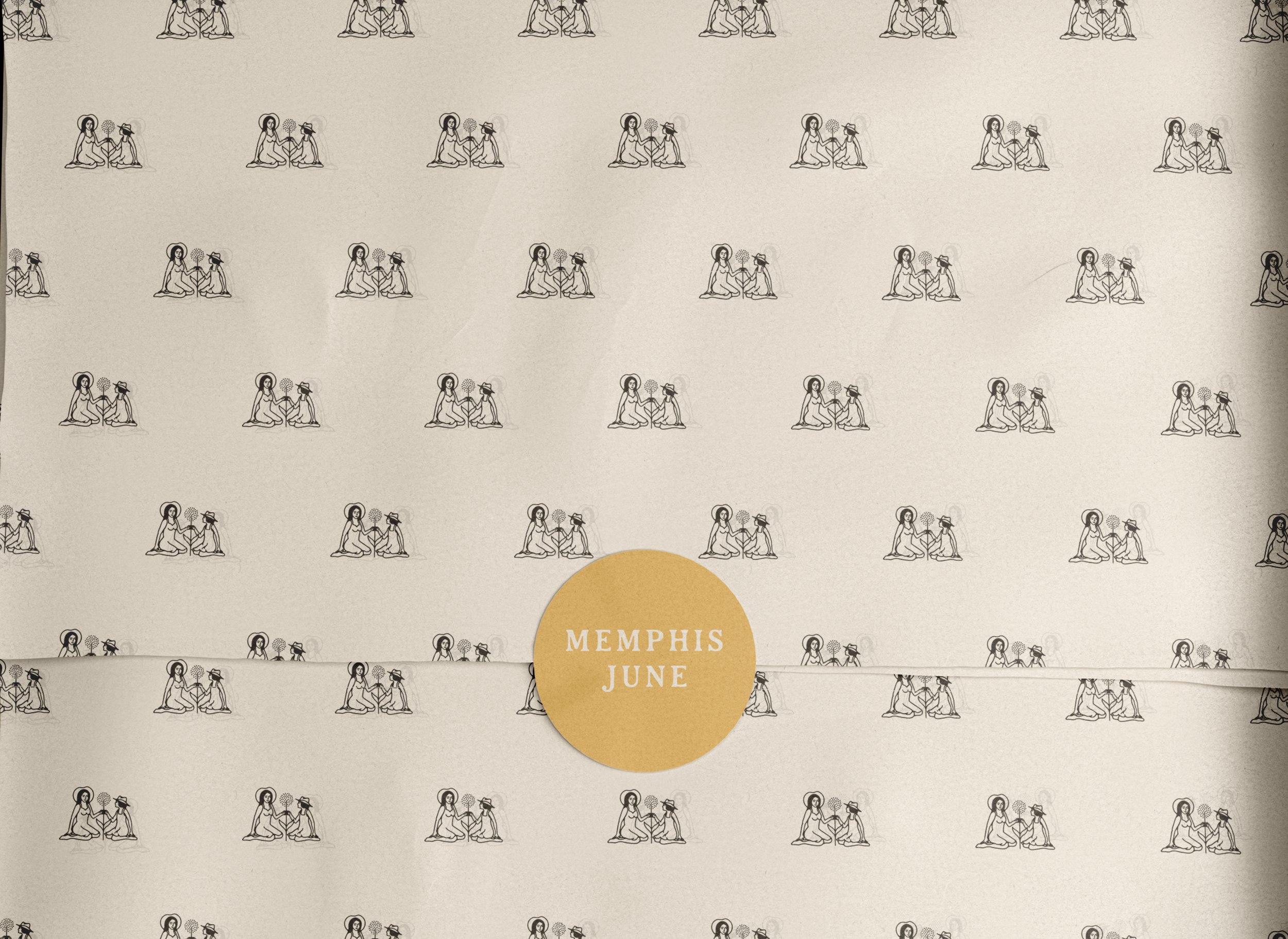
We set out with the goal to create a Sub-Mark that was inspired by Hayley and her daughter in the act of play and we couldn’t be more excited by the outcome. This icon tells the story of Memphis June while also perfectly representing the ideal target audience and surrounding emotions.
In addition to the primary sub-mark, we created an alternative sub-mark to continue telling the brands story in an original fashion while adding overall brand flexibility. This alternative mark captures the moment right before Hayley and her daughter make wishes together on their freshly picked summer dandelions.
Both of these marks really capture the joy and whimsy of Memphis June and tell the story of the brand in a fun and magical light. We believe the originality and story of these logos will help attract and engage the brands target audience - inviting them into a community of like-minded mothers and women.
-
Inspired by the Secondary Mark the Wordmark, lockups and typography selects were created to further the brand story and surrounding emotions. These handcrafted marks use a subtle serif style letterform that balances a western and bohemian look. The letters combined with the Secondary Marks really ties the entire Brand Identity together - creating a timeless and original look that captures the whimsical and nostalgic feelings of the brand.
-
The Color Palette for Memphis June uses an adaptive color approach. The brand is built on a solid foundation of muted earth tones and cream colors. This foundation allows for a more flexible system of pop-colors to add fun to the brand identity. These pop-colors are inspired by nature like the dandelion-yellow, brick-red and dusty-rose.


